Clutch Moving Company is a modern moving and logistics brand founded in the Bay Area that helps people and businesses relocate their homes, offices, and high-value items with professional packing, transport, and installation services.

PRIMARY
STACKED

The Rebrand
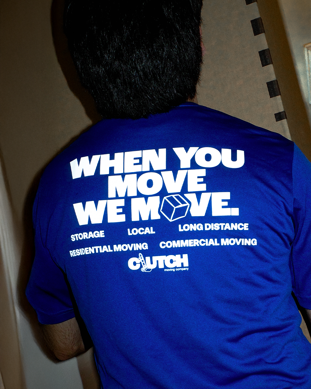
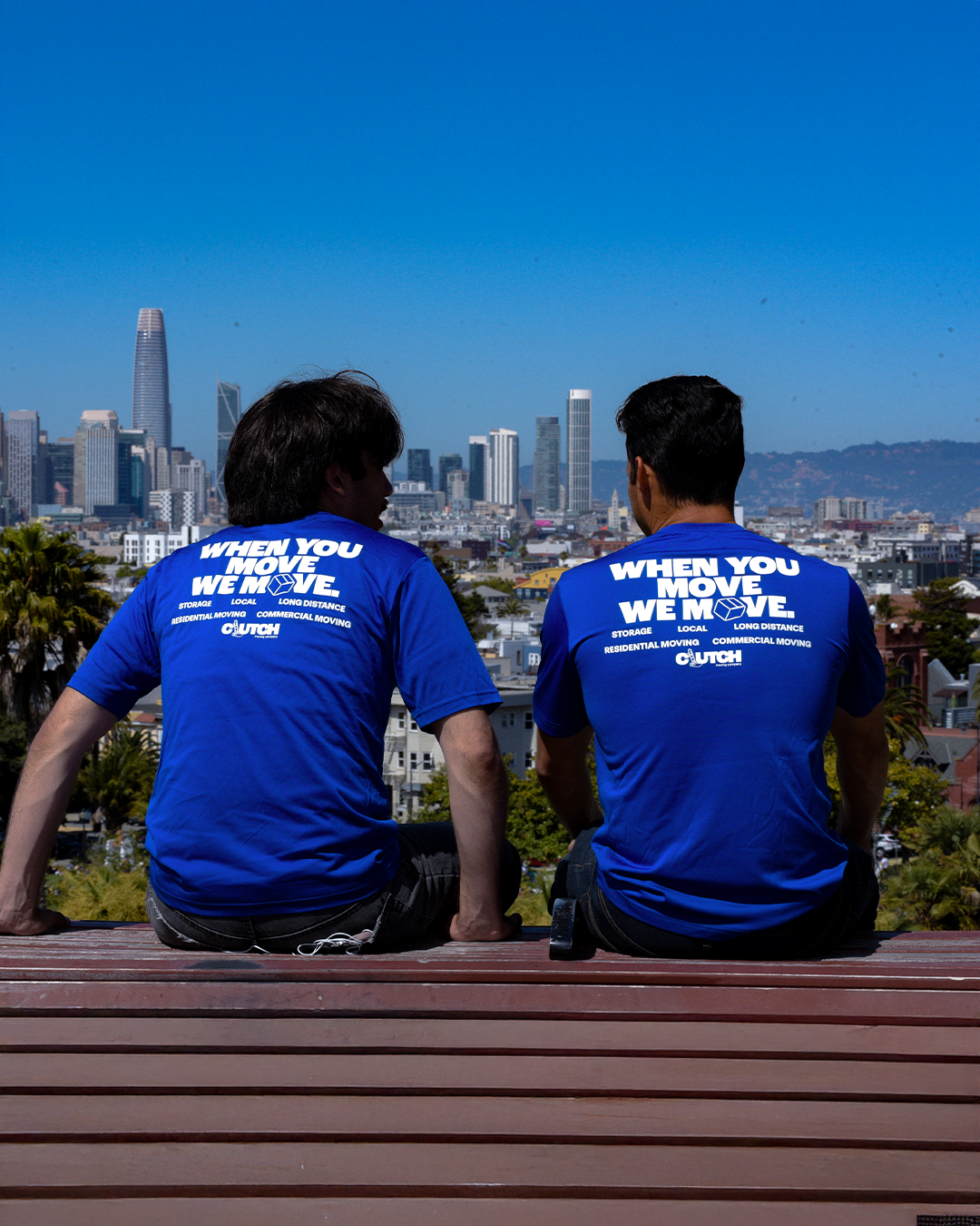
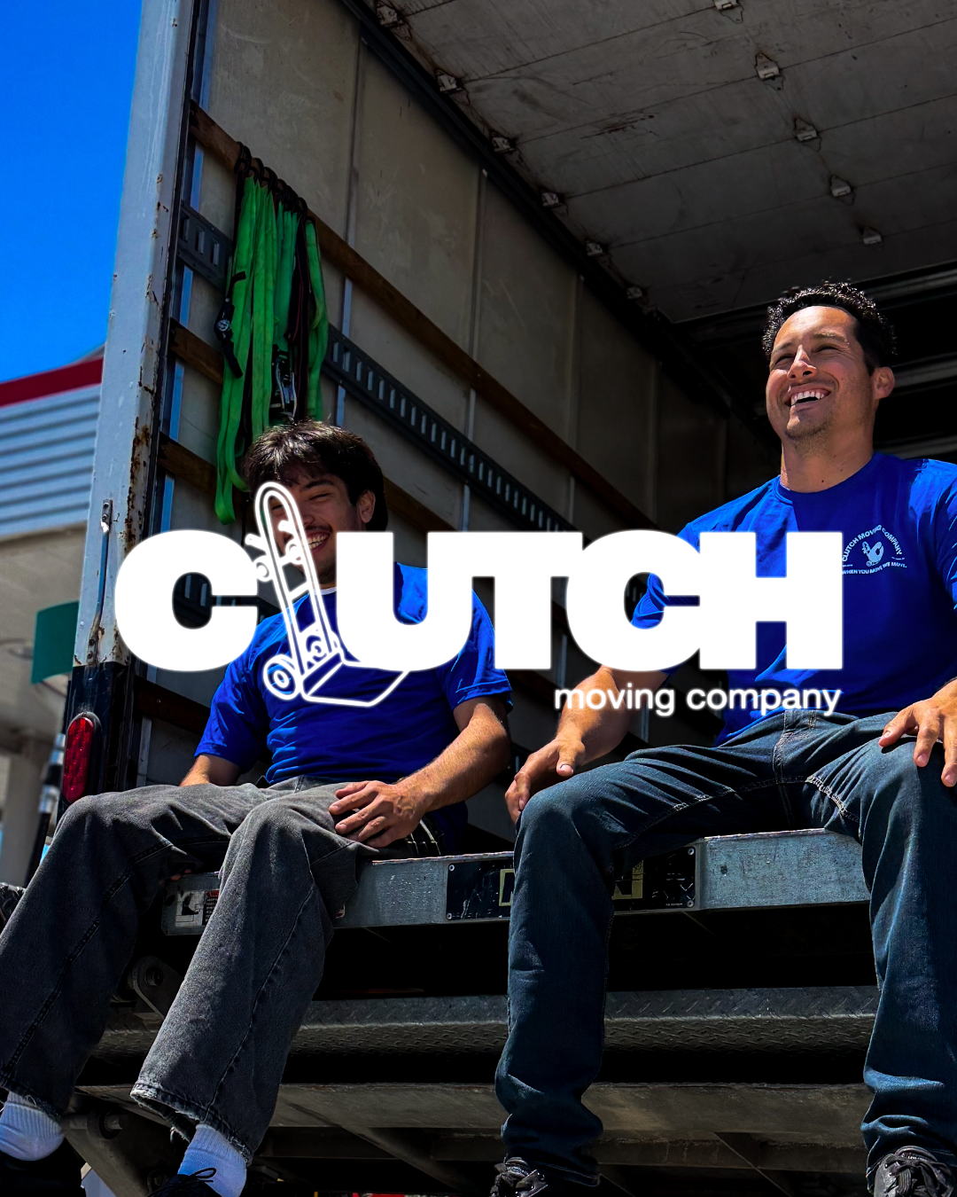
The new identity positioned Clutch as more than a moving company — as a lifestyle brand built on progress and culture. I designed a visual system rooted in clarity and energy, anchored by a confident wordmark and a signature blue that felt fresh, modern, and optimistic.
The goal was to make Clutch feel like that friend who always shows up when it’s time to move — someone you trust, someone with personality, someone who gets it.
2017
THE LOGOS
HORIZONTAL
FAVICON

SIMPLIFIED
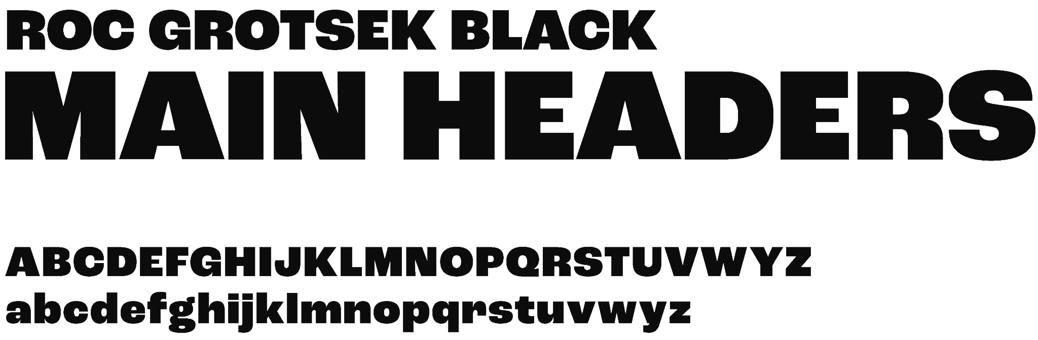
TYPEOGRAPHY


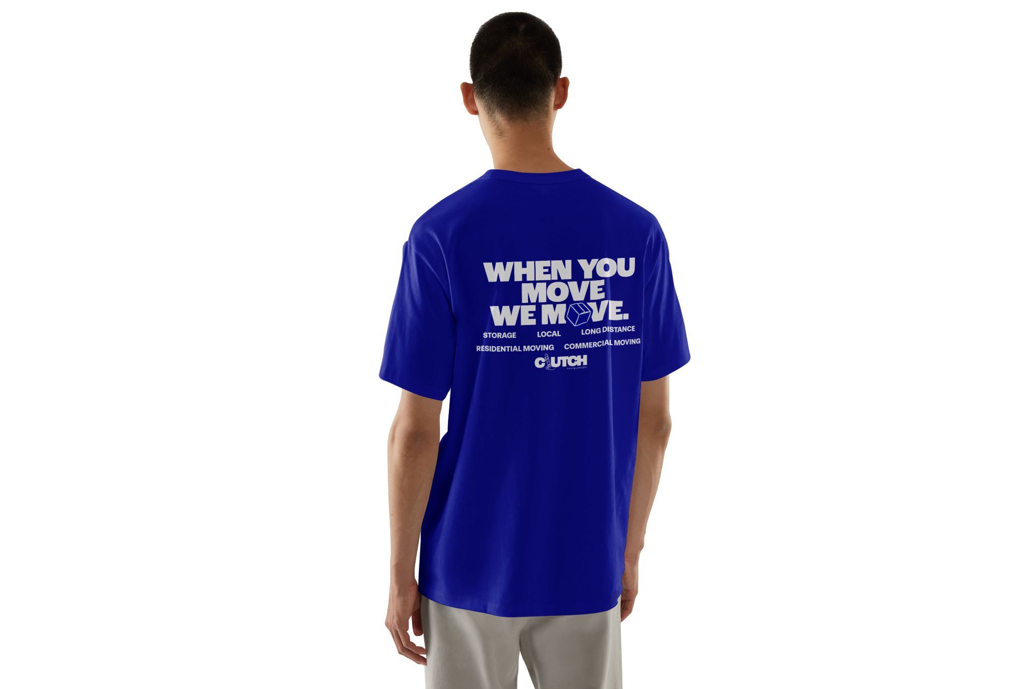
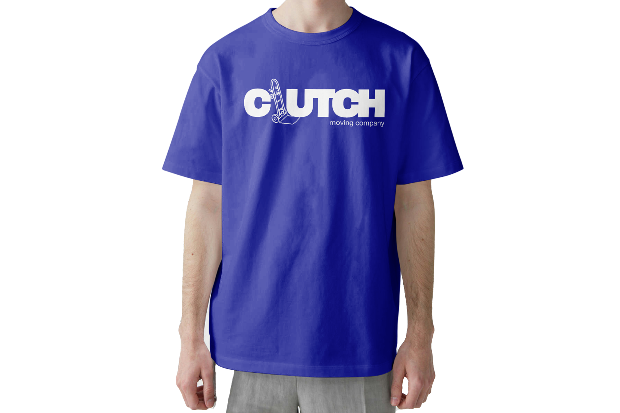
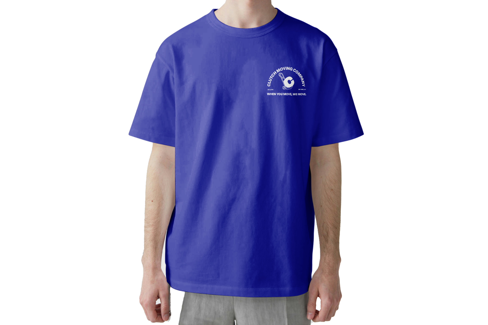
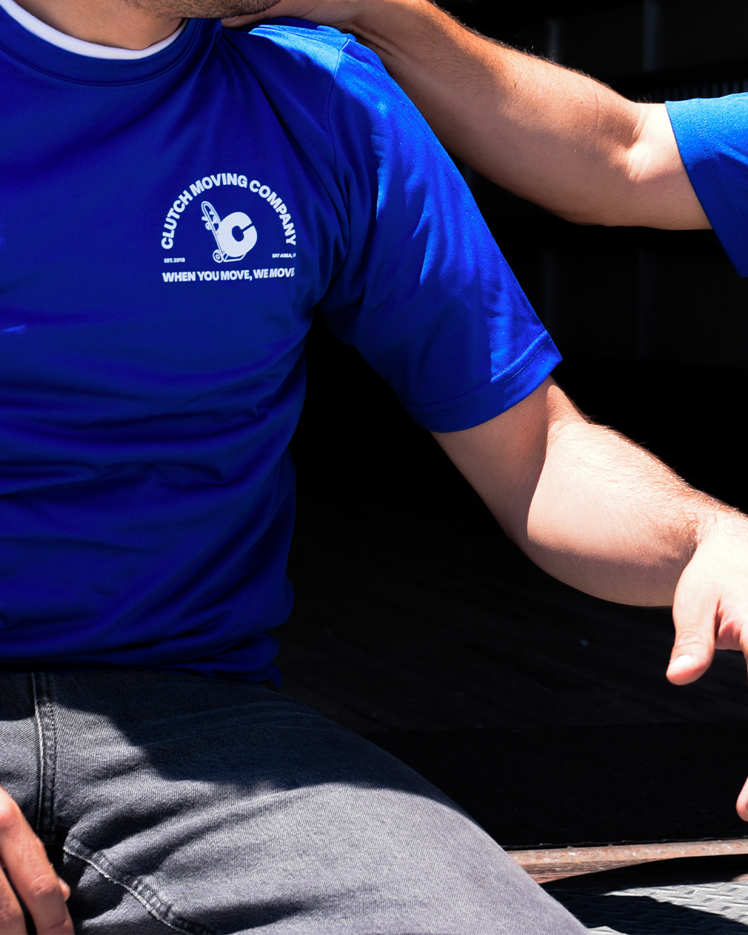
MOVERS SHIRT DESIGN
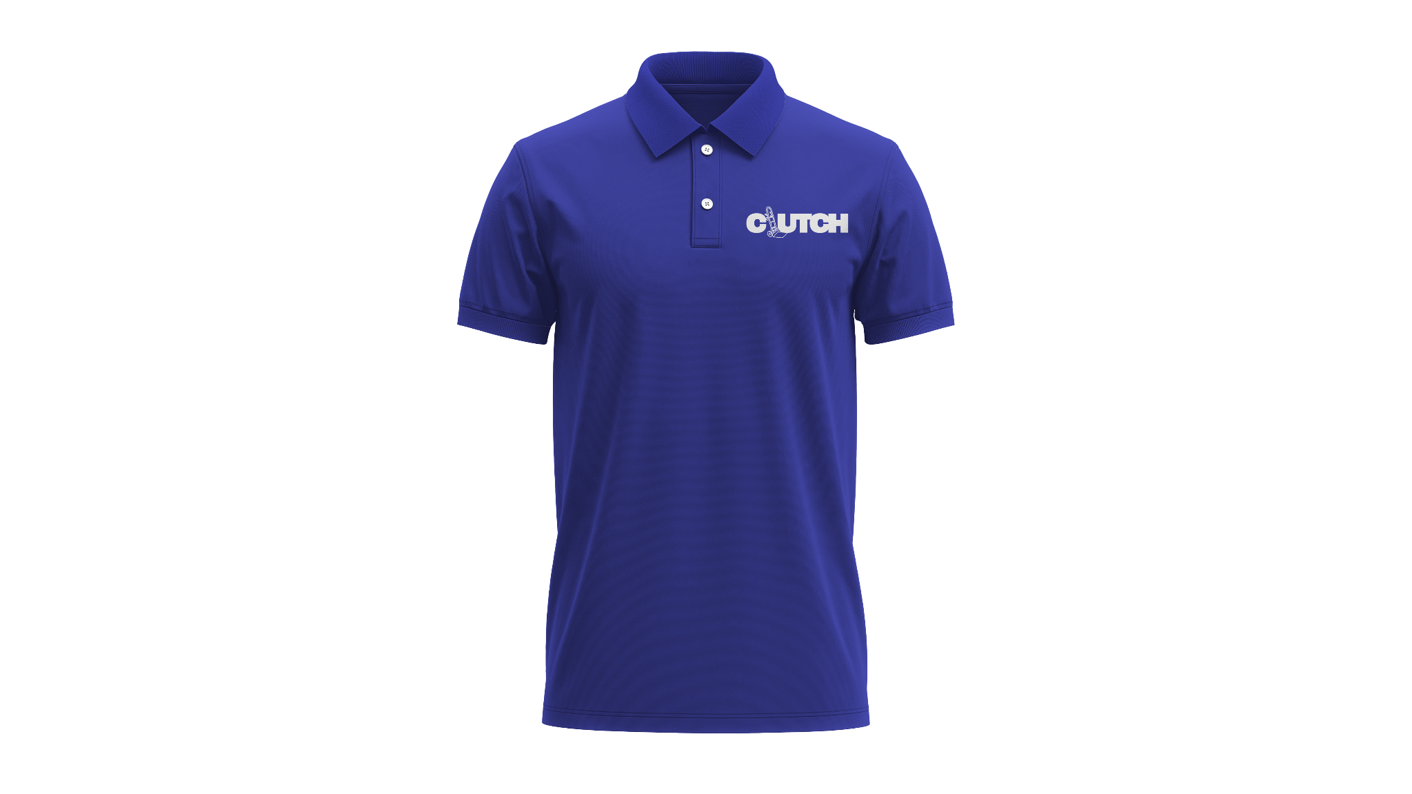
SHIRT DESIGN
OPERATIONS SHIRT DESIGN

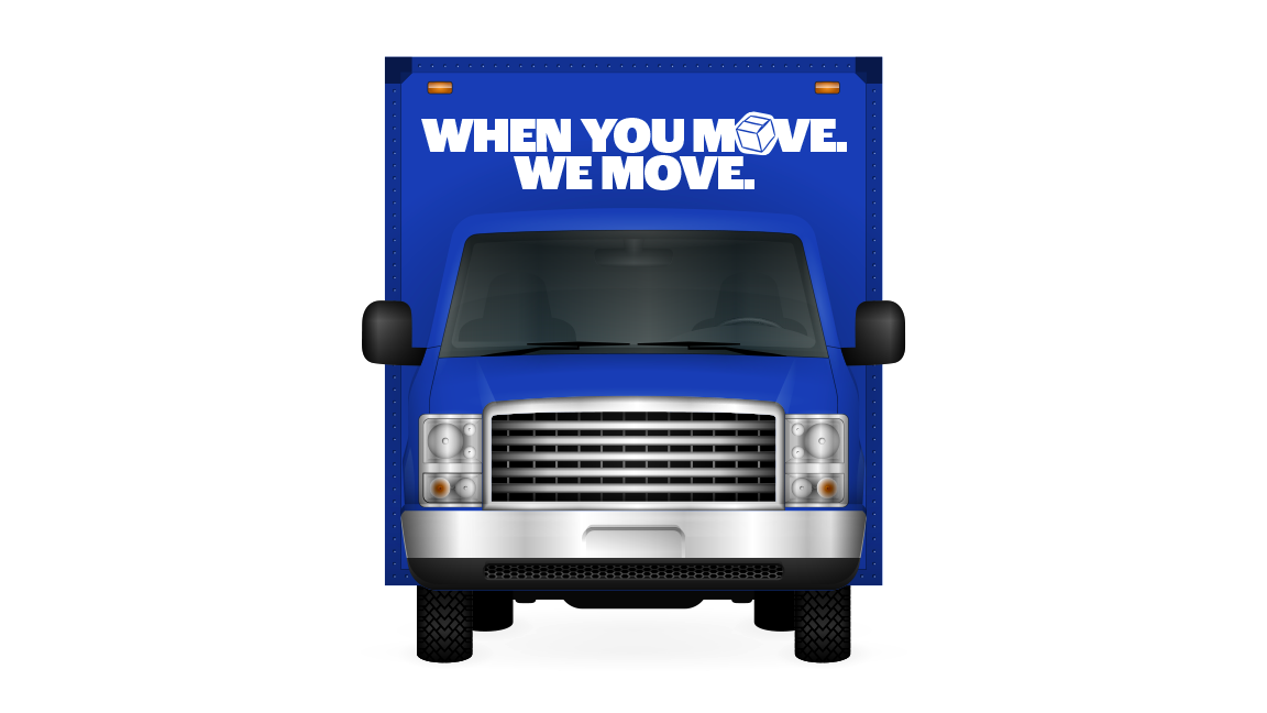
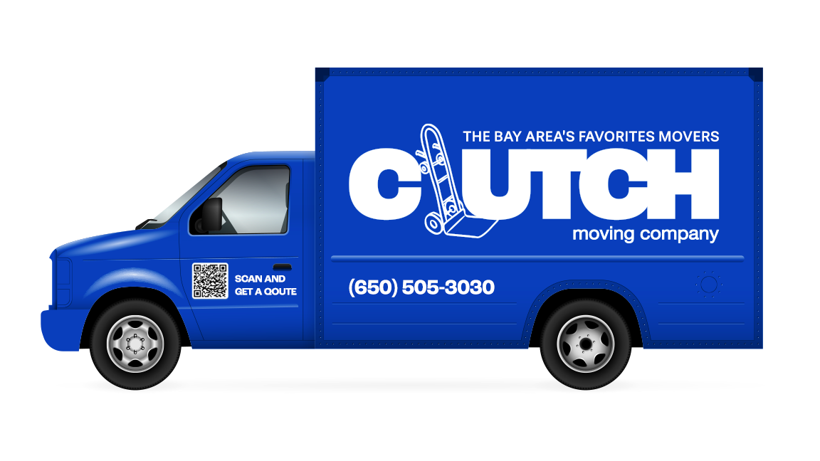
TRUCK DESIGN

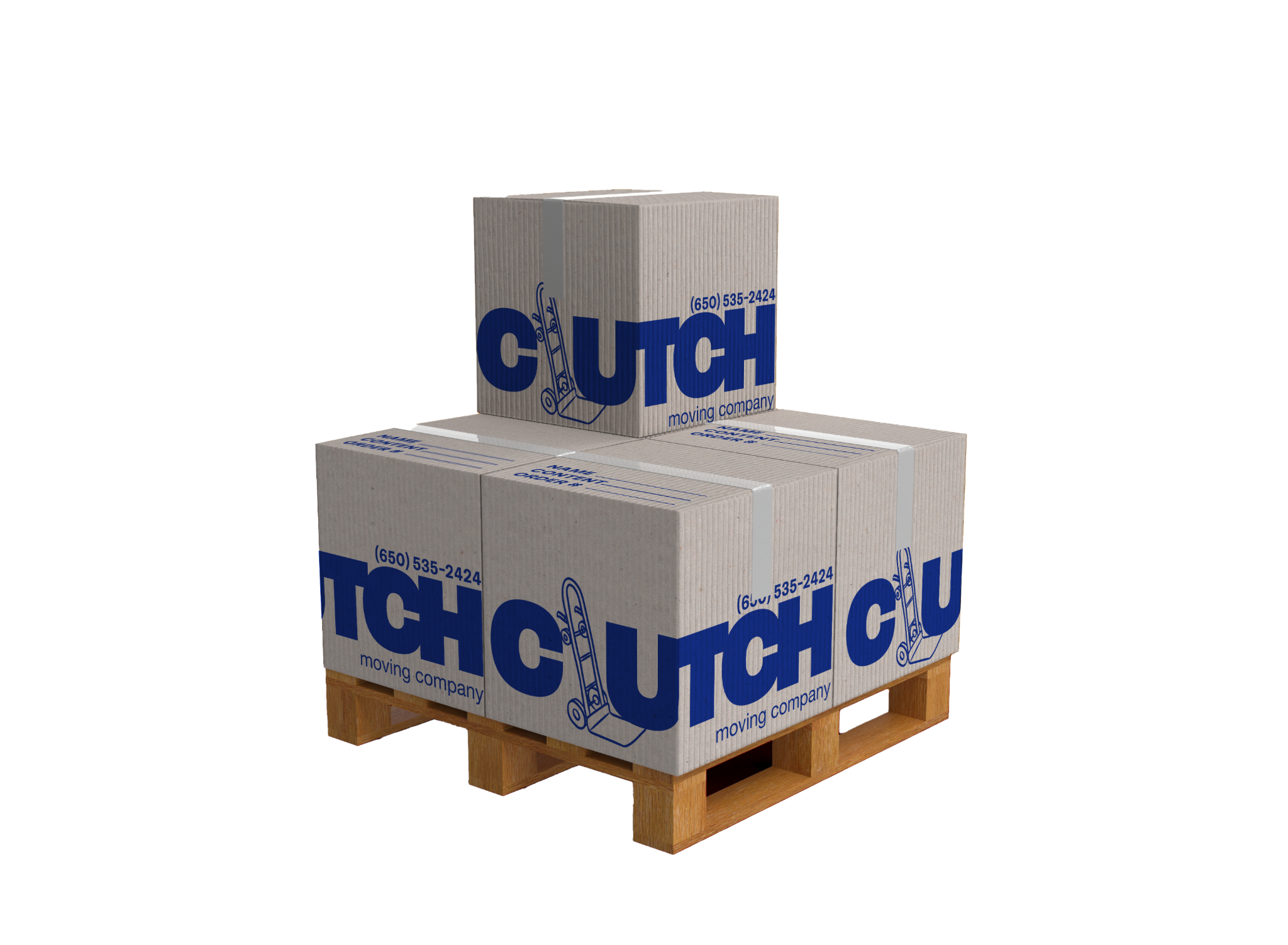
BOXES DESIGN
2025